
»Visualization Review and Critique« - a self-guided workshop at the »Visualizing Open Access« Summer School
by Katrin Glinka
Context and Setting
The workshop on »Visualization Review and Critique« was offered by the HCC Data Lab as part of the »Visualizing Open Access Summer School« that took place between 6 - 17 September 2021. The summer school was organized as a cooperation between Fachhochschule Potsdam (UCLAB), Humboldt-Universität zu Berlin (Berlin School of Library and Information Science), Freie Universität Berlin (HCC Research Group) and the Open-Access-Büro Berlin acting on behalf of the BMBF funded project open-access.network as well as the Vernetzungs- und Kompetenzstelle Open Access in Brandenburg. Due to the pandemic restrictions, the summer school took place online.
The two-week program offered lectures and workshops on topics relating to open access and open research, a lecture by Prof. Dr. Claudia Müller-Birn on how to successfully conduct a data visualization project as well as two keynotes by Johanna Drucker on »Modeling Chronology and Temporality« and Sonja Schimmler on »Research Knowledge Graphs and their Visualization«. The lectures and workshops offered during the course of the summer school were designated to enable the participants to work on and successfully complete their own data visualization project. At the beginning of the first week, the participants were introduced to the dataset that they were invited to work with in their hands-on projects, the »Bundesländer-Atlas Open Access«. During their project work, the teams were mentored by the members of the organizing team that brought together a variety of expertise.
Conducting self-guided workshops during the pandemic
Workshops constitute a central methodic approach of the HCC Research Group's work, which required us to explore options for online workshops since the start of the pandemic. One of the formats that we have explored in several iterations is that of »self-guided workshops«. The basis for this format are online whiteboards (we used an »InVision Freehand« online whiteboard for team collaboration), on which instructions, explanations and tasks are prepared in such a way that each small group of three to four participants is led step by step through the workshop in designated time slots. All groups contribute to one shared online whiteboard, while discussions between the members of one small group take place in breakout rooms (i.e. sub-divisions of the video conferencing software). The workshop leaders rotate through the breakout rooms to answer questions and offer assistance. At the same time, the workshop leaders have an overview of the groups' current progress, since all groups contribute to the shared online whiteboard and document their discussions in real time. This allows the workshop leaders to directly address groups in cases where they identify challenges or when a group is lagging behind and should proceed to the next sub-task on the board.
Conceptualizing the workhop
The workshop on »Visualization Review and Critique« was offered by the HCC Data Lab and conceived by Prof. Dr. Claudia Müller-Birn and Katrin Glinka, who also guided the participants through the workshop. Over the course of 90 minutes, the workshop introduced the participants to a systematic approach that supports them in critically reflecting on visualizations. The goal of the workshop was to support participants in developing skills to critically evaluate visualization designs and transfer this knowledge to the development of their own effective visualization designs in their hands-on projects. The workshop covers aspects such as domain, context, and stakeholders, data type and origin of data, as well as visual encodings, design and interaction techniques. The underlying concept builds on an understanding of critique as " a form of analysis that uses critical thinking to determine whether a design is expected to achieve its desired objectives (and adhere to any pertinent best practices or heuristics)" [1]. The workshop was inspired by a course assignment developed by Jeffrey Herr as well as a course assignment developed by Cecilia Aragon (both at University of Washington).
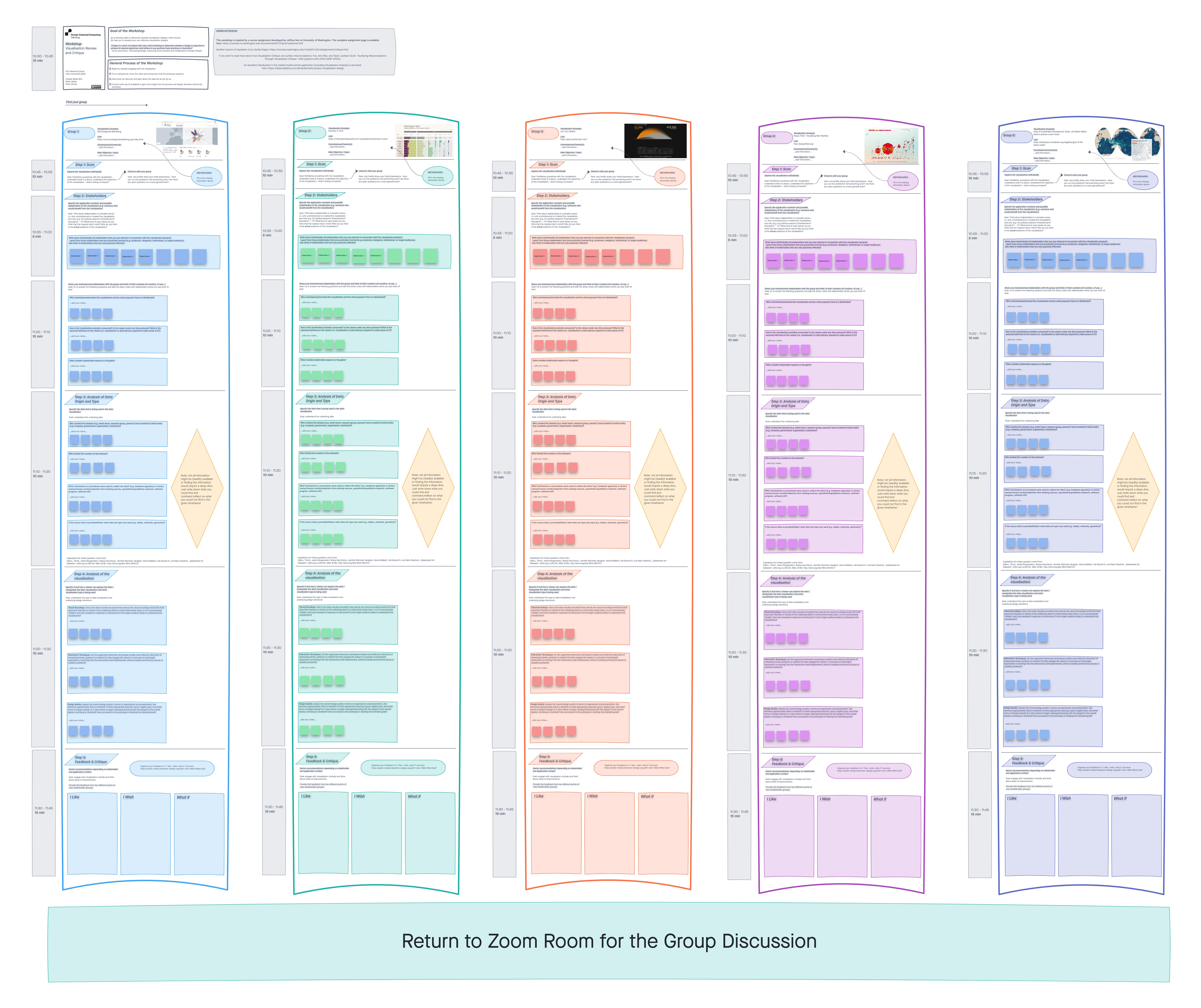
Workshop Procedure

OECD's Regional Well-Being
Image Credit: OECD

»Diversity in Tech«
Image Credit: David McCandless
We had selected five web-based visualizations that represent different genres of visualization, different communication goals, stakeholders and purposes. The examples included the interactive OECD's Regional Well-Being site (1), the »Diversity in Tech« visualization by David McCandless and team at »information is beautiful« (2), the U.S. Gun Killings Visualization by Persicope (3), the independent project »Poppyfield« by Valentina D’Efilippo and Nicolas Pigelet that visualizes war fatalities (4), and the interactive chapter on »Life Below Water: Marine species under threat« from the »Atlas of Sustainable Development Goals«, published by the World Bank (5).


»Poppyfield«
Image Credit: Valentina D’Efilippo and Nicolas Pigelet

»Life Below Water: Marine species under threat«
Image Credit: World Bank
The online whiteboard was prepared in such a way that each group would go through the instructions in a self-guided manner. To start, they casually engaged with the visualization that their group was assigned to. They were instructed right at the beginning to try to exhaustively cover the views and interactions that the visualizations support. In addition to their interaction with the visualization itself, they were invited to also consult write-ups (if available) to gain more insight into the process and design decisions behind the visualization or regarding the underlying data.
The self-guided workshop follows a five-step process. During step one, the participants individually explore the visualization assigned to them with the goal to familiarize themselves with the visualization, understand what it is about, i.e. they should understand the objective of the visualization and what message is being conveyed. After their familiarization, they were asked to check in with their group to briefly share their initial impressions and discuss open questions or things that should be clarified before proceeding. In step two, the groups specified the application contexts and (intended) stakeholders of the visualization (e.g. someone who would benefit from the visualization). They were also asked to think about stakeholders in a broader sense, for example in terms of who commissioned or created the visualization and why (e.g. for political reasons, entertainment, or educational purposes) as well as what they perceived as the intended users/viewers and actual audience of the visualization. In step three, the groups addressed the type of data and its origin. Leading questions for this step pertained, amongst others, to the creators of the dataset (e.g. which team, research group, person) and on behalf of what entity (e.g. company, government, organisation, institution) as well as to what mechanisms or procedures were used to collect or create the data (e.g. hardware apparatus or sensor, manual human curation/selection from existing sources, quantitative/qualitative research etc.). The questions for this step were inspired by Gebru et al.'s »Datasheets for Datasets« [2].

Screenshot from the online whiteboard
Image Credit: HCC
In step four, the participants were instructed to analyze the visualization in terms of the used visual encodings, interaction techniques and the overall quality of design (e.g. are elements appropriately titled or labeled? Is there appropriate spacing, layout, legible type, and other forms of design styling? Is it clear where to begin viewing/interacting with the design? How successful is the prototype in meeting the intended goals?). The fifth and final step invited the participants to summarize their insights in their overall feedback and critique, for which they were asked to derive recommendations depending on stakeholder and application context. The goal of this last step was to engage with the visualization critically and to think about areas of improvements. The groups were asked to provide this feedback from two different points of view that should correspond to the stakeholder groups that they had identified in step two. The feedback was organized alongside a »I like, I wish, what if« structure. After completion of the five steps, all teams left their breakout rooms and joined a final discussion and reflection with the other participants. As part of this group discussion, each team briefly presented their insights based on their notes on the online whiteboard.
Reflection and Discussion
The workshop was planned for a 90-minute slot as part of the summer school program, which we consider a minimum requirement. If the workshop is to be conducted in a shorter time frame, the tasks would need to be reduced. Although all teams were able to complete the five steps of the workshop, the depth of engagement with the visualizations and the final group discussion would have profited from more time. The participants' ability to critically evaluate visualization designs did not only support them in their own visualization projects, but also translated into how they were able to provide feedback during the final project presentations that concluded the summer school.
After the first installment of the workshop during the summer school in September 2021, we conducted the workshop again as a course assignment during the Data Visualization course in the Winter Term of 2021. Based on our learnings from the summer school, we included a short »gallery session« of 5 minutes that helped the students to grasp the concept of stakeholders. The gallery session took place after the groups have worked on step two - specification of the application contexts and (intended) stakeholders of the visualization. For the gallery session, each group was asked to arrange their material (sheets and post-its) on their desks and should also make the visualization assigned to them accessible on a screen. The students then take 5 minutes to walk around the room and read what other groups have collected so far. Afterwards, a short group exchange takes place and the groups get the opportunity to write down additional observations that the others have provided them.
Having conducted the same workshop twice, once in a purely online format, once in an in-person classroom format, we can conclude that the self-guided workshop is well suited to guide the participants through the steps. However, the activity in small and separated groups of 3-4 people creates a setting in which each group is primarily focused on their assigned example visualization. While it would have been unfeasible and disruptive to gather the whole group after step two (i.e. have them leave the breakout rooms, gather in the main videoconference, go back to the breakout rooms), this was easily done in the classroom situation. We highly recommend to include the gallery session, which provides the participants with more insights. If the workshop is to be conducted in an online format, we recommend to plan more time that would also allow for a back-and-forth shift between breakout rooms and main session.
[1] Connor, Adam, and Aaron Irizarry. "Discussing design: improving communication and collaboration through critique". O'Reilly Media, Inc., 2015.
[2] Gebru, Timnit, Jamie Morgenstern, Briana Vecchione, Jennifer Wortman Vaughan, Hanna Wallach, Hal Daumé III, und Kate Crawford. "Datasheets for Datasets“. http://arxiv.org/abs/1803.09010v7