Workshop Procedure
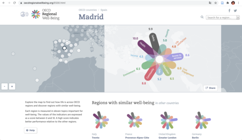
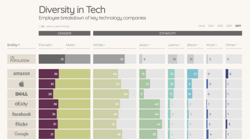
We had selected five web-based visualizations that represent different genres of visualization, different communication goals, stakeholders and purposes. The examples included the interactive OECD's Regional Well-Being site (1), the »Diversity in Tech« visualization by David McCandless and team at »information is beautiful« (2), the U.S. Gun Killings Visualization by Persicope (3), the independent project »Poppyfield« by Valentina D’Efilippo and Nicolas Pigelet that visualizes war fatalities (4), and the interactive chapter on »Life Below Water: Marine species under threat« from the »Atlas of Sustainable Development Goals«, published by the World Bank (5).


